

Overview
Client was a transportation agency for a mid-sized metropolitan area. Due to expansion, a few more bus routes were added and the city developed a way to know how far each bus is from the bus stop. I created this app to make it easy for riders to access that information
Role & Responsibilities
UX Research, UX Design, UI Design
Problem
Come up with a method for users to find out:
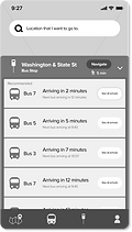
1. When will the next bus arrive at a bus stop
2. How much time does a rider have to get to the bus stop
Solution
-
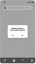
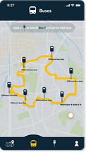
Navigation System
-
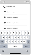
Search function and recommendations
-
Ability to see each bus arrival at stops
-
Ability to see future bus arrivals
Discovery and Research
Competitive Analysis
I performed a competitive analysis on popular bus apps Google maps and NJ transit to see potential risks and features that could be avoided and added to this bus app.
Google Maps
NJ Transit
-
Lets user search up destination to find recommended routes
-
Offers navigation
-
Provides current location
-
Visually appealing and most popular app
-
Inaccurate real time info on bus arrival times
-
No information on other buses arriving at a particular bus stop
-
Lot of information for user
-
Shows capacity
-
Shows real time info on bus location
-
Too much information to navigate through
-
Very visually unappealing
-
No navigation
User Surveys/Interview

What bus app do you use?

How often do you use bus apps?
-
88.9% of bus app users used Google Maps
-
"It's so much easier to use"
-
"I just put in the destination and it tells me everything I need"
User Persona
Tap images for a close-up view

Journey Mapping
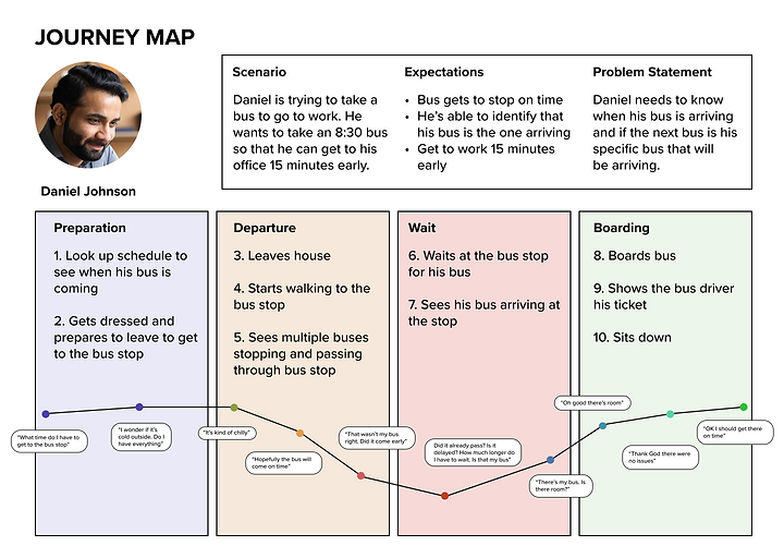
Takeaways
-
Buses could be running late
-
Could see multiple buses pass and wondering if one of them are his
Define
User Flow

Site Map

Wireframes
Drawn Wireframes

Digital Wireframes


Usability Test 1
User Feedback:
-
Users didn't like the full schedule
-
Users preferred a simpler search bar
-
Users preferred a full screen over the pop up screens for the bottom navigation tabs
Develop
Design and Branding


User Flow (v2)
I made some changes to the user flow and site maps, the most important change being that I removed the path to search up bus stops and bus lines on the search bar.

Site Map (v2)

High Fidelity Prototype
After making changes to the wireframes as well, using my colors, I created a higher fidelity prototype closer to the final product that users could click through to conduct my final stage of usability tests.


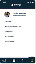
Accessibility
After adding color to my wireframes, I also added a visual accessibility feature that would help users with colorblindness distinguish what tab they were currently on.

Usability Test 2
-
88% of users had difficulty identifying the icons in the bottom navigation bar
-
66% of users had difficulty understanding what the orange outline indicated on the bus arrivals screen when they first saw it
-
100% of users didn’t know what the yellow button on bus schedule page was for
-
100% of users expected to see only bus 7 arrivals after clicking recommended bus and route
-
77% of users preferred scrolling over clicking the “view all” button to see all the future bus arrival times


Deliver
Refining Prototype
I took the data gathered from user testing to create iterations, reapplying to my designs and making certain adjustments to arrive at my solution.


Conclusion
To solve the problem, I created an app with a navigation system for users. A search function that recommends the user specific buses and routes, the ability to see what time each bus was arriving at specific bus stops, and the ability to see future arrivals for all buses.
Through this entire process I was really able to learn that what I think is good design could be completely different from what users want, and I also learned the importance of testing, using data from those tests to back up my design choices, and the importance of iteration.