
Overview
According to client's research and experience, the current process of switching shifts for nurses was inefficient and the problem he came to me with was "how might we make it easier for nurses to switch shifts" So I created an app that would make the process of switching shifts much easier.
Role & Responsibilities
UX Research, UX Design, UI Design
Problem
Current shift switching process for nurses is inefficient.
Solution
An app for nurses that allows users to switch shifts much more efficiently and effectively
Design Sprint

Survey/Interview Insights
-
Shift switch requests are manual, or they have to reach out to the nurses directly to see if they’d want to switch
-
They have computer software that aren’t intuitive and annoying to use
-
Didn’t know all the nurses on their team personally and have to ask other colleagues for that specific nurses number
-
They receive physical calendars or have a communal physical calendar in the hospital that they had to check to see the teams schedule
How Might We
Tap images for a close-up view

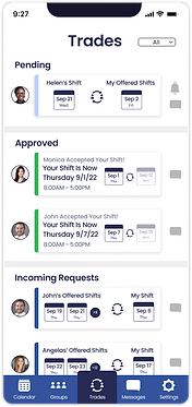
App Requirements
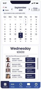
1. A Digital Calendar
2. The ability to see other peoples shifts and my own
3. The ability to switch shifts with other nurses virtually
4. Ability to check switch request status
User Flow Diagram

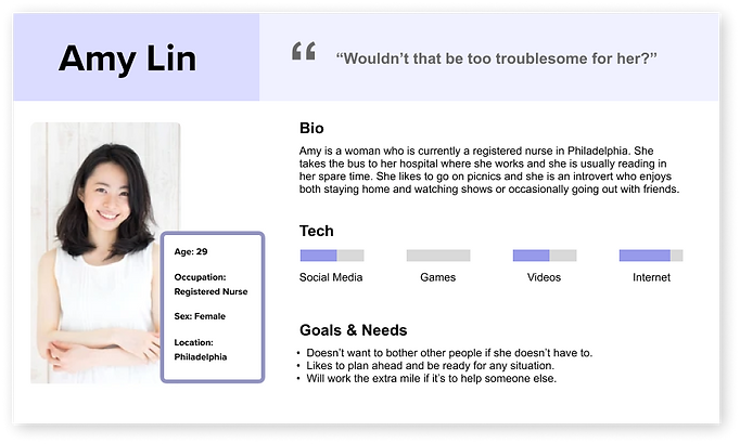
User Persona
Empathy Map

User Journey Map

Takeaways:
-
Can see calendar
-
Finds people she can switch with
-
Ability to request
-
Getting requests approved
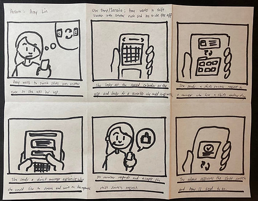
Storyboard
4 Step Sketch


Solution Sketch

Digital Wireframes


Accessibility
Added a bump on the bottom navigation to allow users with a hard time seeing difference in shade or color to see what tab they were on.

Tasks
User Testing:
1. Request a shift switch with a colleague on Sept 21 with your shift on Sept 2
2. Check the status of the request you just made to your colleague
Immediate Findings
-
0% of the users tested knew that the calendar itself was clickable
-
Instead of looking at the date, they immediately clicked "request" on the first page which their eye was drawn to first even though it was the incorrect date.
V1 to V2 changes
Added Guide Text and "Today":


Added Guide Text and Increased Visibility of Date:


Added indicator of current date:


Usability Testing
-
100% of users knew that the calendar was clickable
-
50% clicked the wrong icon in the bottom nav, and clicked the groups icon instead because they assumed it was "social"
-
25% clicked Sep 2 first to see their own shift to try to switch through that
-
Some of the users thought the trade page information was too small to read
V2 to V3 changes
Guide Text Change:

Added Labels:


Simplified Info Displayed:


Solutions
-
Digital calendar on phone
-
See team schedule and request switch with anyone on the team
-
Request switch remotely
-
Check switch request status
-
Easy to use
Next Steps
-
Adding a messaging feature to allow users to follow up on requests
-
Adding a groups feature so that users can invite their coworkers
-
Adding an option for day vs night shifts, and 8 hour vs 12 hour shifts

High Fidelity Wireframes


What I learned
Originally, I wanted to create an app experience where the users wouldn't have to read too much and they could go through the app using the icons and different indicators, but through this process, I learned that adding text/instructions to guide users through the app can actually increase usability significantly. In this specific case implementing guide text improved the usability of the app by 100%, and it just made the app much more easy to use.