


Overview
The tab grouping feature in Safari is extremely inefficient, frustrating to use, and usually goes unnoticed. I decided to redesign the user experience and design to make organizing and navigating through tabs a much easier process for the user while browsing.
Role & Responsibilities
UX Research, UX Design, UI Design
Problem
Based on an analysis of Safari's current tab-grouping feature and surveying users, I've identified the
following problems:
1.Tab groups not on same interface so user has to click back and forth in-between groups
2. Users are required to name tab groups
3. No settings visible to the user
4. No preview of tabs in each tab group
Solution
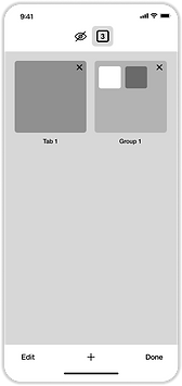
A new redesign with visible features and options that allow users to arrange and create tab groups on the tabs interface.
Discovery and Research
Auditing Safari's Current Flow
Tap images for a close-up view
Creating a Tab Group Flow 1:


Creating a Tab Group Flow 2:


Moving tabs to other tab groups:

Navigating through tab groups:

User Surveys/Interview


-
73.8% use Apple phones
-
16.7% use Samsung Phones
-
42.9% use Safari
-
52.4% use Google Chrome
-
61.9% have over 5 tabs open at a time, 19% having 21+ tabs
Samsung Google Chrome (IOS Doesn't support tab grouping)
-
85.7% of Samsung Google Chrome users knew that they have the tab grouping feature
-
57.1% Samsung users group tabs, and 100% of users who don’t group tabs have less than 5 tabs open at a time
-
Samsung/Google Chrome is doing a good job of letting users know about the feature
-
If the user has a lot of tabs, they will use the tab group feature
Since people are using it, it must be easy to use and improving the browsing experience.
Apple Safari
-
77.8% of Safari users don’t know that they have the tab grouping feature
-
The 22.2% of Safari users who knew that they have the tab grouping feature do NOT use the feature
-
50% of the people people who know of the feature have 15+ tabs
-
Apple is doing a poor job of letting users know about the feature, and it’s not easy/efficient to use
Considering that most people seem to be using Iphones, and almost 50% of ALL phone users surveyed use Safari, there is a significant target group of users that would benefit from having a solid tab groups feature to improve the experience.
Competitive Analysis
According to survey results, Google Chrome is Safari's biggest competition, but Google Chrome IOS does not support tab grouping so this is for Google Chrome Samsung specifically.
Google Chrome
-
all tabs and tab groups are on the same page interface
-
option to select multiple tabs and group selected tabs
-
Very intuitive design and use with click and drag
-
Shows preview of tabs in tab groups
Strengths
-
Cannot rename tab groups
-
No way to organize tabs by priority
Weaknesses
SWOT
After identifying strengths and weakness for their competitor, I performed a SWOT analysis on Safari.

User Personas


Journey Mapping
Safari CURRENT experience

Takeaways:
-
User who has a lot of tabs could be frustrated with number of tabs and want to organize more
-
Frustration with being moved to different screens for tabs groups
-
If a mistake is made, sending tabs back to original screen can also get frustrating
-
User ultimately gives up using feature
Define
User Stories

Site Map (Current)

Site Map (Redesign)

For the Site Map redesign, I focused on simplifying the options and removing the options that are shown from holding the tab entirely to avoid confusion.
User Flow (Current)

User Flow (Redesign)
For the User Flow redesign similar to the Site Map, I focused on simplifying the entire process and so that users can achieve their intended tasks much quicker and much more efficiently.

Wireframes


Develop
Style Guide


Mockup

Accessibility
I also considered the possibility that some people could have difficulty holding and dragging to create tab groups, so I wanted to allow those users to be able to just tap the screen a few times without having to have any special interaction to be able to create the groups, IF they wanted to.


OR
Tasks
User Testing:
1. Create a new tab (To see if testers can identify what the + sign is)
2. Create a tab group
3. Take out the homepage from the tab group and erase that tab group
4. Create another new tab and create a tab group using another method
Immediate Findings
-
I included a second tab as a reference for the creating a tab group instructions
-
Because testers are tasked with creating a new tab, I only have them create a new tab with the newly created tab and homepage
-
Testers were confused and they tried interacting with it multiple times.
-
Decided to remove the second tab so that testers wouldn’t be confused
V1 to V2 changes

Removed the reference tab:


Usability Testing
(10 people were tested)
-
9 testers had a seamless process
-
3 testers got confused with "Done" and "Group". Some eyes were drawn to the top right, and assumed "Done" would also group
-
Few testers mentioned that holding/dragging over was a very natural process for them
-
1 tester was relieved that there were instruction/guide text shown in the test
-
1 tester skimmed over instructions but successfully completed tasks
-
4 of testers identified the renaming feature and tried to use
Deliver
V2 to V3 changes
Text/Button placement change:


Solutions
-
All tabs and tab groups are on the same page
-
Users aren’t required to name group
-
”Edit” is a visible option for users
-
Alerts user that the feature is available
-
Allows selection tab grouping
-
EASY TO USE
Next Steps
-
A focus on the group renaming feature
-
Groups disappearing when there is only 1 tab left
-
Having a checkbox on top left so that users have option to select tabs immediately


Conclusion
While working on this project, I learned that users like what they are familiar with, and it makes it easier for a user to learn how to use a feature for an app if they are already using those gestures.
I can emphasize that this was a great exercise in content design in how I was able to build understanding quickly. Instead of using design or guide text to take up real estate, a tutorial with instructional text in the beginning clears up exactly how to use it.